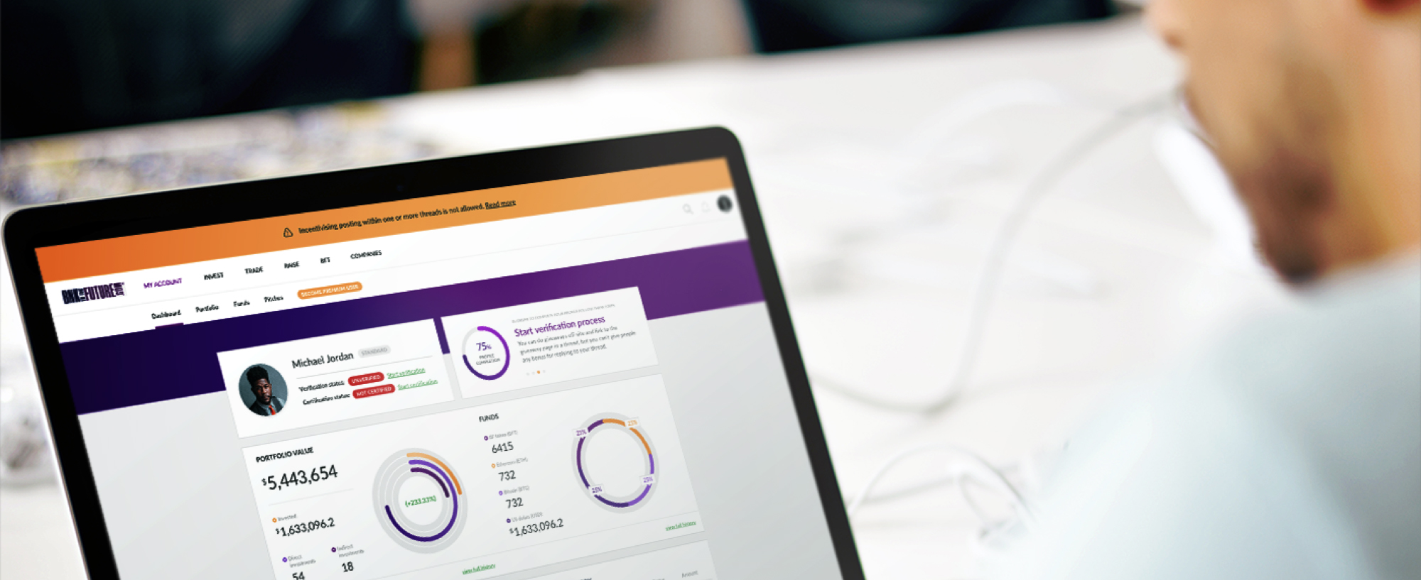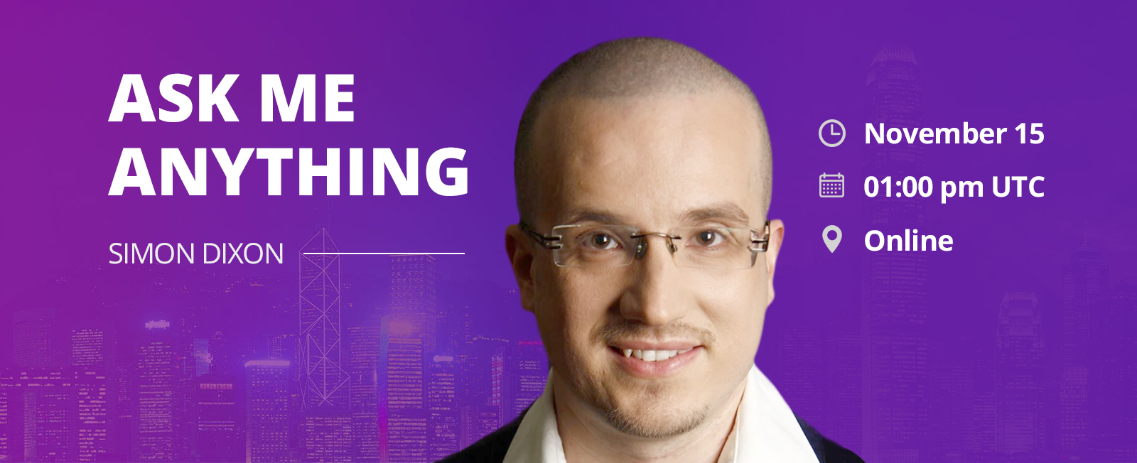
In parallel to numerous other product launches and upgrades, we believe it is really important to modernise the core platform experience. The dashboard, which is the hub and heart of your investment portfolio, seemed to be a great place to start. After numerous iterations and analysing existing feedback and combining this with real user behaviour data, we have come up with a solution that emphasizes the most important features of our ecosystem, while making those less used less prominent.
Here’s what we have come up with:

It might be a lot to take it all at once, so we prepared a summary of the most important changes
- You will notice the notification and announcement system gets a complete overhaul. Currently, you’re being redirected to the announcement after logging in, instead of visiting the page you intended and there’s no way of viewing that message again. Both of those issues will now be gone.
- We also realised that many users found it confusing when it came to getting their profile investment ready. Quite a few conditions have to be met, including identity verification, confirmation of the investor status and two factor authentication setup for account security, yet they are scattered all over the platform and meeting all those conditions requires commitment. With the new dashboard, this should not be a challenge anymore.
- For a long time, there has been confusion between what makes the investor verified in terms of their identity and then what makes them eligible to invest in certain products in various markets. You will notice that the dashboard allows you initiate those processes and monitor your progress getting through them.
- We have recognised that our community has grown exponentially over the years and certain features that were once very valuable are now redundant. This includes the ‘All activity’ log which we intend to phase out completely with the new interface.
- You will be pleased to see we intend to significantly boost the positioning of account activity log (Recent activity). It is our belief that this will boost the security of your account enabling you to spot any potential anomalies much quicker.
- Last, but certainly not least, we’re proposing to make your funds independent from your portfolio. At the moment, you’re forced to click through the transactions to learn the details, and changing screens numerous times in the process. The new dashboard will enable you to monitor your balances and portfolio from a single page and compare them, without the need to navigate away from it.
It goes without saying that the new design will have mobile experience in mind just as much as the desktop one, making your BnkToTheFuture truly portable for the first time.
While we think we have a solution that will solve many problems you’re facing today, we realise we can also make premature assumptions. Before we go ahead and implement a change as drastic as this, we’d like to ask you for your feedback on our work thus far, as well as any other suggestions, recommendations or even priorities you might have.
If you can spare a few moments to help us achieve that, please leave a comment below.


